Showing posts with label print disabilities. Show all posts

Wednesday, December 5, 2012

Bookshare: New Contest, Cool Prizes, Starting Soon!


Bookshare
Made a
Difference
Contest


How has Bookshare helped
YOU?


Bookshare logo


Follow us! Facebook logo Twitter logo

Forward this message to a friend
Has Bookshare made a difference in your life?
Enter the "Make a Difference Contest" and a chance to win awesome prizes!

How does it work?
Tell us in 150 words or less how Bookshare has helped you, your child, or students and inspire other people with print disabilities to read.


What can you win?
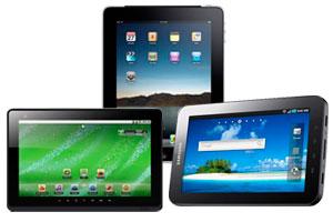
image of three different types of tablets
Grand prize: tablet of your choice!
2 Runner-up prizes: MP3 players

When does the contest run?
Monday, Dec. 3 - Sunday, Dec. 9
Want to be notified when it starts?
Sign up to be notified!


Click to view this email in a browser

Benetech
480 S. California Ave., Suite 201
Palo Alto, California 94306
US

Read the VerticalResponse marketing policy.
Non-Profits Email Free with VerticalResponse!

Visual Impairments Specialist Scotlandville Magnet High School of Excellence http://lee.ebrschools.org/kathynicholslee
http://www.kathyskids.org
http://teacherweb.com/LA/RobertELeeHigh/MrsMichael/t.aspx
http://mskathyskids.blogspot.com

APH Guidelines for Print Document Design

http://www.aph.org/edresearch/lpguide.htm

These are some great guidelines to remember for the classroom as well. I'm printing a few here and the rest can be found at the link provided above. For some of my babies with learning disabilities who are in resource or special classes I suggest using Comic Sans font as it's like the teacher's handwriting. ~K

J. Elaine Kitchel
Low Vision Project Leader
American Printing House for the Blind

The American Printing House for the Blind (APH) believes guidelines for print documents should be brought to a standard of optimal usability for persons with low vision. The standards should be based on fundamental principles gleaned from research that originated from the study of the impact of print characteristics on readers of print products. This research also includes existing industry standards, where they apply.
With the advent of word processing, document design has become an intrinsic part of writing. Writers for APH encounter a wide array of new printing options. The knowledgeable use of these options helps the writer gain an advantage because readers of APH materials have become accustomed to very well-designed documents. For the writer of documents at APH, it has become an imperative to be knowledgeable about typography and design.
It is impossible to teach the writer everything he/she should know in a brief primer, but here are the essentials:

A. Use a Readable Typeface/Font

For text, a readable typeface means a sans-serif (/san-ser-if/) typeface (or font) made up of mainly straight lines. A serif is a short stroke that projects from the ends of the main strokes that make up a character. These are not desirable for use in a book to be read by persons of all ages and/or persons with visual impairments.
Although serif typefaces often work well in headings and personal stationery, they can be difficult to read in continuous text. Among the better san-serifed typefaces are APHont, Antique Olive, Tahoma, Verdana, and Helvetica.
The minimum size of any typeface to be used on APH documents is 12 points. Most large
print is 18 points.
  • 12 pt. = regular print
  • 14-16 pt. = "enlarged" print (not considered large print)
  • 18 and larger = large print
  • 18 and larger, with other formatting changes = enhanced print
  • Note: Students who need print 28 points or larger should probably be considered as candidates for Braille education.
Here are the primary things to think about when selecting a font for use by persons with low vision:
  1. The upper case "I" and Roman Numeral I, the numeral 1, and the lower case l, should all look different from one another.
  2. The font should be wide-bodied with space between each letter. Letters which have a bubble inside them, such as o, d, g, and others should have plenty of space inside the bubble.
  3. Punctuation should be rounded, large and very visible.
  4. For these reasons APHont was developed and is suggested as a font that meets all necessary guidelines.
  5. Font strokes should be solid and without gaps in them.

B. Use White Space

Ample white space makes a page more readable and useful because it provides contrast to the print and creates luminance around the text. The primary ways to create white space on the page are to use generous margins, e.g., margins of at least one inch for letters and other business documents. Another way to provide white space is to provide ample spacing, leading and kerning to text.
APH encourages its writers to:
  • Indent 1 inch at margins
  • Justify left margin, unjustify right margin
  • Use a wide, san-serif font for ample kerning
  • Space 1.25 between lines, especially on forms where underscores and boxes are used to provide space for writing
  • Double space (30-34 pt) between paragraphs or other bodies of text
  • Use block paragraph style, no indents
Other ways include white space are, supply headings and sub-headings, enumerate items in separate paragraphs, subparagraphs, or bulleted lists.
White space is especially important on forms. Lots of horizontal lines, or grids with horizontal and vertical lines can be very difficult for some people with visual impairments to follow across the page. These difficulties can be minimized through the use of pastel, colored background for every alternate line. Example below:
State Year Auto Sales Home Sales Boat Sales
Alabama 2010 309,436 99,307 27,397
Delaware 2010 214,556 78,477 39,765
Virginia 2010 349, 887 125,095 33,482
Washington 2009 272,299 69,433 30,442
Crowded text detracts from readability and usability because contrast is limited by too much black text. In studies, persons with normal vision who filled-out crowded forms often lost focus before they reached the end of the task. Persons with vision impairments struggled more than their typically-sighted peers with forms and text.

See more guidelines at http://www.aph.org/edresearch/lpguide.htm


Friday, April 10, 2009

Cheap Finds to Use with Children with V.I.


LASER TOP: This toy was at Walgreen's drug store in the sale bin It requires batteries. I thought of it as visual stimulation for low vision multi-disabled kids as it can be spun for them on their wheel chair trays. It lights up, spins and makes a sound. It has a hazardous choke warning so for children who can grab and handle it themselves I'd be certain they have an MA of 5 years and over, as it says on the package, so they will not be tempted to put any parts of it in their little mouths.


VIBRATING BALL: I've had this one for a few years, also with multi disabled children in mind. I had a child with cortical visual impairment and deafness. Pull the string and this one vibrates. Use much supervision as the string may detach. For the kids I used it with, I would pull the string for them. Some were able to let me know they wanted the action repeated by either grabbing my hand or in the case of a nonverbal child with modified signs, she would sign "again." It doesn't make a sound, though. This one is hand sized. There is a larger version of this one that runs by batteries and makes a sound as it vibrates.


TEACHING COINS: I saw these in another teacher's class and thought, Wow! I have needed something like that for my low vision kids when I was teaching money!

She was going to let me borrow hers to make copies
. But in my travels I saw these at Dollar Tree in the school supplies section. I have found coin worksheets on line AND placed real coins under the CCTV for students with low vision. When you don't have access to a CCTV or can't carry several in your back pocket, these are a cool alternative. They are printed on front and back. The adult size scissors didn't show up too clearly, but I placed them in the picture to give a size reference.

I've had these laminated and I will have them brailled for low vision students who read braille

Wednesday, April 8, 2009

Reading Rights!!!!

Here is a quoted paragraph from the web site. Please go to this site at http://www.readingrights.org/ and sign the petition.

As technology advances and more books move from hard-copy print to electronic formats, people with print disabilities deserve the opportunity to enjoy access to books on an equal basis with those who can read print.


People with print disabilities cannot effectively read print because of a visual, physical, perceptual, developmental, cognitive, or learning disability.

No Need for Greed

We Want to Read!


We represent 15 million Americans who cannot read print because of blindness, dyslexia, spinal cord injury, and other print disabilities. We include school children, the elderly, professionals, college students, returning veterans, and your neighbors, family members and friends. We want to buy books. We have fought very hard for many years to have equal access to technology and information. For the first time, now that the Amazon Kindle 2 offers text-to-speech, which will read a book aloud, we can purchase and enjoy books like everybody else. Sadly, the Authors Guild does not support equal access for us. The Guild has told us that to read their books with text-to-speech we must either submit to a special registration system (that not all may qualify for and that would expose disability information to all future eBook reader manufacturers) and prove our disabilities -- or pay extra. The Guild’s position is contrary to the principle of equal opportunity for all and discriminates against millions of people with print disabilities.


Please support us by joining our informational protests and Sign the Petition: We Want to Read.